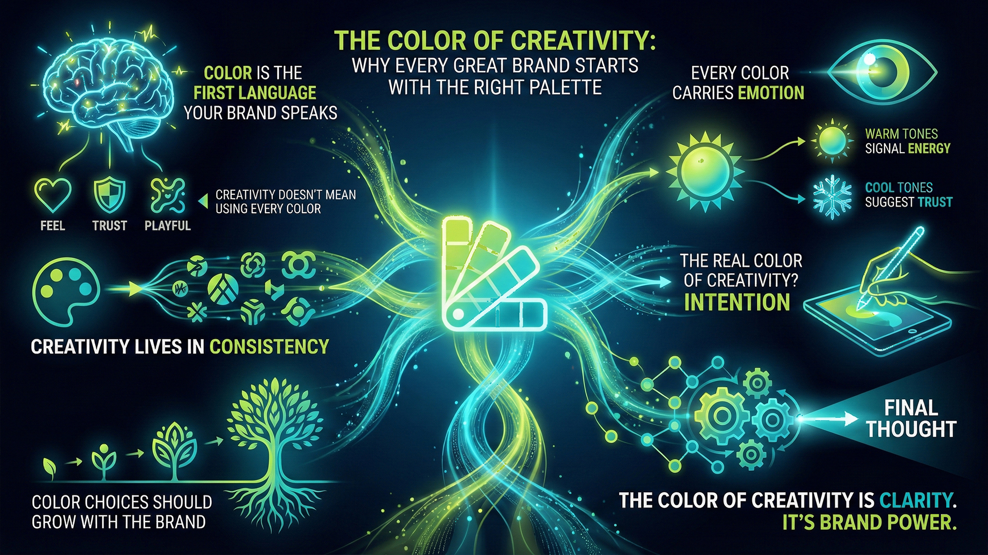
The Color of Creativity: Why Every Great Brand Starts With the Right Palette
Creativity doesn’t always begin with ideas.
Sometimes, it begins with color.
Before someone reads your content, understands your product, or trusts your service they feel your brand. And color is often the very first thing they feel.
That’s why color isn’t decoration.
It’s communication.
Color is the first language your brand speaks
Humans process visuals faster than words.
Within seconds, color tells people:
- • whether a brand feels bold or calm
- • modern or traditional
- • premium or playful
You may not consciously notice it, but your brain does.
That’s why some brands feel instantly trustworthy, while others feel forgettable.
The difference often lies in intentional color choices.
Creativity doesn’t mean using every color
A common misconception is that creative brands must be colorful.
In reality, creativity is about control, not chaos.Some of the most creative brands in the world:
- • use limited palettes
- • repeat colors consistently
- • let restraint speak louder than excess
True creativity knows when not to add more.
Every color carries emotion
Colors create associations whether we plan for them or not.
For example:
- • warm tones often signal energy and approachability
- • cool tones suggest trust and stability
- • monochrome palettes feel confident and timeless
Over time, these colors become tied to brand memory.
People may forget your tagline, but they remember how your brand felt.
Creativity lives in consistency
Changing colors frequently might feel “fresh,” but it often weakens brand recall.
Consistency:
- • builds recognition
- • strengthens memory
- • makes brands easier to trust
When people start recognizing you by color alone, that’s when branding starts working.
That’s creativity at scale.
Color choices should grow with the brand
Many small businesses choose colors quickly, based on trends or personal preference.
But as brands grow, their audience changes, goals evolve, and positioning shifts.
That’s when color needs reevaluation, not to follow trends, but to reflect maturity.
Great brands don’t chase colors.
They refine them.
The real color of creativity? Intention
Creativity isn’t loud by default.
It’s thoughtful.
The most powerful brands use color with purpose, aligning emotion, message, and experience into something people recognize and remember.
Because in the end, creativity isn’t about standing out once.
It’s about being remembered.
Final thought
The color of creativity isn’t red, blue, or any trend of the year.
It’s clarity.
When color is chosen with intention, creativity stops being visual noise, and starts becoming brand power.
#Creativity #BrandDesign #ColorPsychology #GraphicDesign #BrandIdentity #VisualBranding #DesignThinking #Roex #RoexDesign